Data Communication & Digital Transformation
Here are two examples of how we take data from creation to communication via Digital Transformation.

Who
30,000+ State and Federal policymakers and healthcare leaders across America.
What
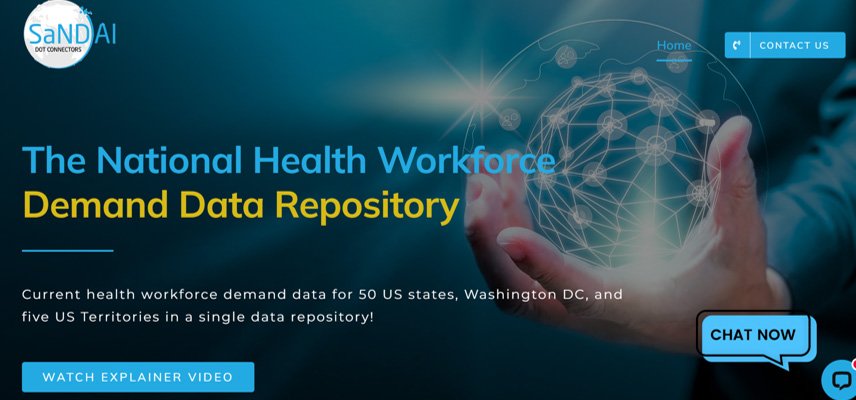
The National Health Workforce Demand Data Repository
Why
The US faces a significant health workforce crisis! To effectively tackle the health workforce crisis, state and national leaders must leverage better health workforce demand data to enhance need forecasting efforts and to innovate resource allocation procedures to increase the workforce pipeline and expand scholarship opportunities in communities of need. We have begun the process.
The National Health Workforce Demand Data Repository helps policymakers better understand America’s present-day health workforce challenges at the community level across multiple healthcare organization types, i.e., rural hospitals, community health centers, nursing homes, etc. Policymakers will better predict and forecast health workforce demand three, five, and even ten years into the future.
How (Data Creation)
We collected healthcare vacant jobs data across nearly 4,000 healthcare organizations in DC, MD, NC, and VA from their websites and compiled the information into a single database and stored the data in Azure.
How (Data Communication)
We then analyzed the data and created tableau-based dashboard visualizations for users to view current workforce demand data by position, education requirement, and provider organization type at the national, state, city, and zip code levels. Additionally, we created a summary website and an accompanying AI-generated video to communicate results with key stakeholders.

Who
10,000+ Board members, CEOs, CFOs, COOs and other stakeholders of 1,250 Community Health Centers
What
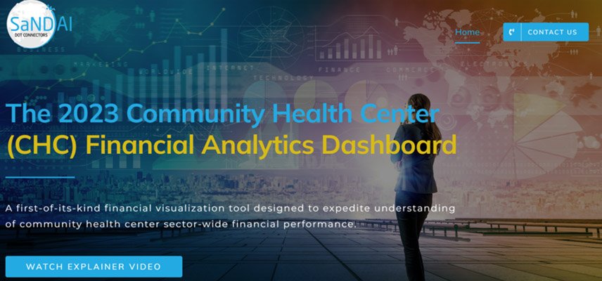
The 2016 – 2021 Community Health Center Financial Analytics Dashboard
Why
We designed the Community Health Center Financial Analytics Dashboard to shed light on the financial health of more than 1,250 community health centers. It is a first-of-its-kind financial visualization tool designed to expedite understanding of sector-wide financial performance. Financial performance comparisons to local, state, and national-level peers across 10+ critical financial metrics and easy-to-understand visualizations are now possible.
How (Data Creation)
We compiled financial data from over 10,000 audited financials into a single database and stored the data on Tableau Server.
How (Data Communication)
We developed easy-to-understand visualizations using Tableau, created a summary website, and produced 1,250+ AI-generated videos to communicate results. We are in the process of sharing videos with all 1,250+ community health centers included in the analysis.
